
Customization options
Through HelcimPay.js you can control a range of styling and display elements for the payment modal that is rendered.
Configuring your payment modal custom styling
By passing an optional customStyling object, you can control a range of styling settings for your HelcimPay.js payment modal, including:
- Whether the modal utilizes light theme, dark theme, or the customers system default theme.
- Whether the modal displays key elements with your chosen brand colour.
- What corner radius elements within the modal are displayed with.
- What text is displayed on your payment button.
Parameter | Type | Description |
|---|---|---|
| string | Specifies the theme of the HelcimPay.js modal, accepting string values for |
| string | Specifies the primary brand color of the HelcimPay.js modal, accepting a string value of a 3 or 6 character hex code without the # symbol. |
| string | Specifies the corner radius for elements within the HelcimPay.js modal, accepting a string value of Basic |
| string | Overrides the text displayed in your payment button, accepting a string value of The button text for a |
Through your customStyling object, you can pass any combination of parameters based on your preferences. Parameters not passed will revert to their default displays.
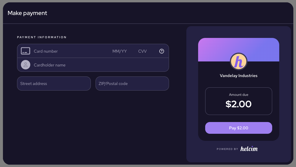
Standard modal using dark theme
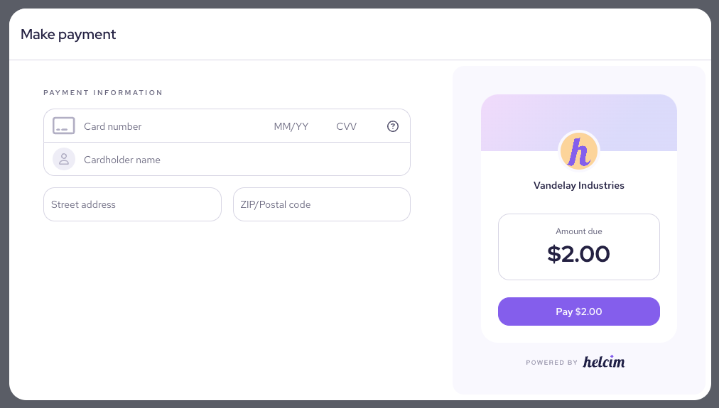
Standard modal using light theme
Selecting your payment modal confirmation screen style
By using the optional confirmationScreen parameter in your HelcimPay.js initialize request, you can determine whether payments display the new updated confirmation screen, or utilize the legacy toast message for payments.
| Parameter | Type | Description |
|---|---|---|
confirmationScreen | boolean | Passing a value of "true" will display the new confirmation screen style for successful transactions. Passing a value of "false", or passing no parameter, will default to the original toast message style for payment confirmations. |
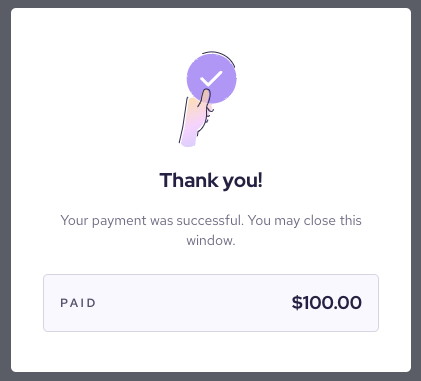
New HelcimPay.js confirmation screen

Original HelcimPay.js toast message
When the customer closes the confirmation screen the HelcimPay.js iFrame will emit an event with the eventStatus of HIDE. This will be a second event triggered after the event with the eventStatus of SUCCESS for the customers payment and transaction response.
In instances where you have initialized your HelcimPay.js checkout session with allowExit = false, then the confirmation screen would not have a close button and therefore would not emit this event as it would require the customer to close the tab or window.
Adding your logo to the HelcimPay.js modal
Uploading your logo to the Helcim system to be displayed on your HelcimPay.js checkout modal can be completed through the API Reference section of our developer documentation, or by integrating with our branding logo endpoint to allow you to change the logo easily within your existing system.
The uploaded logo must be smaller than 2MB and must be either a JPG, JPEG, or PNG file format. You can upload your logo using the following HelcimPay.js endpoint.
Successful upload
If your file meets the requirements for upload, the API will response with a status 200 success message to indicate your file was uploaded. The logo will be displayed within the HelcimPay.js modal in the amount overview panel.
{
  "message": "Logo is uploaded successfully."
}
Updated 29 days ago